A new version of Qute is out! This time for Windows, Linux and Mac!
Users and contributors are welcome!
The Look
Of course it has the Qute look that I have blogged about here: minimalist user interface, full screen mode, beautiful background, text with drop shadows. The goal is to make staring for hours on a page of text as visually appealing as possible.
In this regard, one always has to find a compromise between "bling" and accessibility. In contrast to all the text editors and word processors I know, Qute decides to err on the side of "bling".
I have already spent many hours of writing with Qute and, at least from my point of view, this visual playfullness does not hamper usability and it does not get tiresome. Quite the opposite: the depth a subtle background image and drop shadows lend to a page of text makes it less tiresome to stare at for a long time.
Here are a couple of screenshots of the themes that come with Qute:
The Idea
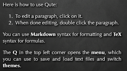
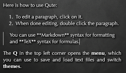
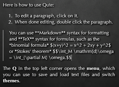
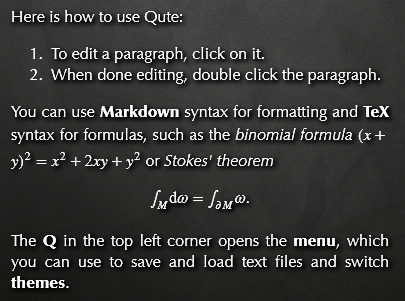
But on top of that Qute for PC/Mac has a couple of features that have not made it to the Android version, yet. The key feature is best explained in pictures:
Now, I would like to elaborate a bit on the motivation behind this idea of switching paragraphs individually.
Rationale
I do not have to go through the advantages of a clear separation of content from layout. Neither do I plan to ramble about the annoyances of WYSIWYG editors (lack of control, conflation of concerns) or the pains of editing markup (hard to read and plain ugly). The consequence, in my opinion, is this:
Digitally edited documents have both an abstract structure and a visual appearance and word processors should make this duality transparent to the user.Most text editing programs recognize this need. However, neither Microsoft Word's different views of a document nor the typical style of LaTeX-editing, where you have one window with LaTeX source and one window with the PDF output next to each other, suffice in this regard.
Nonetheless, there are several pieces of software out there with innovative approaches to this problem. Let me just mention three.
The Competition
Emacs' preview-latex package replaces all the TeX formula markup in your buffer with typeset formulas. All of sudden, you are able to actually read the paragraph you wrote five minutes ago right in your editor. When I found this package, I thought it was almost too good to be true. After using it for some time (and struggling with a few bugs along the way) I came to two conclusions: First, having to run preview manually all the time quickly gets tiresome. It would be much better, if preview were triggered automatically as I type. Second, while the text is readable now, it is still not pretty, because the formulas look completely different than the rest of the text. (The main issue here is that TeX-snippets rendered into bitmaps do not look good alongside a different TrueType font.) Would it not be a good idea to have entire paragraphs typeset by LaTeX, instead of just individual formulas?
Peter brought TiddlyWiki to my attention, which is an entire wiki stored in a single HTML file. The idea is that your wiki consists of several interlinked pages. When editing a page, you are presented with a textarea which contains the defining markup. Once you are done editing, you get fully formatted HTML output. This is great, but as the set of pages in your wiki does not have a linear structure, you end up writing longer texts into a single page - which means that you are staring at a textarea most of the time, with formatted output nowhere in sight. This led me to the conclusion that "wiki pages" are too coarse a unit, when it comes to switching between source code and rendered output.
As far as I am concerned, TeXmacs is the holy grail of word processing interfaces. TeXmacs is a WYSIWYG editor that still manages to make the underlying structure of the document transparent to the user. A document in TeXmacs is just an S-expression (a scheme data structure) and when moving the cursor you actually navigate in this expression tree and not in a supposedly linear string. This is communicated to the user by various unobstrusive means, from subtle boxes drawn around formatted spans of text to the behaviour of the cursor itself. On top of that you can switch into source mode and view the S-expression directly.
If TeXmacs is so brilliant, why am I not using it? The main reason is that TeXmacs uses a custom typesetting engine. While this works well, it does have some quirks, and maintaining a typesetting engine is too big a task for the realitively small community behind TeXmacs. (Small compared to the communities behind LaTeX, Gecko or WebKit.) One particularly annoying side-effect of this was that the only really usable font of the fonts that come with TeXmacs is Knuth's Computer Modern, which I simply cannot stand anymore.
(A propos: Almost every decision made during the design of TeXmacs succeeded in isolating TeXmacs from the open source community. It used none of the big windowing toolkits and thus was ignored by the Gnome and KDE communities. It did not use LaTeX for typesetting and was thus ignored by the LaTeX community. It did use a custom scheme-based file format and was thus ignored by both the LaTeX community and the booming Web/XML community. While TeXmacs does have an XML converter, a text editor stands and falls with its native file format. Finally, TeXmacs had little luck with marketing itself. While most LaTeX users are aware of LyX, almost nobody has ever heard of TeXmacs, even though both have similar functionality and, in my opinion, TeXmacs is way better. But that only as an aside...)
One thing to note about all of the programs mentioned so far, is that they firmly stick to the "monochromatic text on monochromatic background" paradigm that makes all word processors such a bore to look at. As mentioned before, I wanted to do something about that.
Design Decisions
All of these considerations led to the following design decisions for Qute.
The ideal software for writing would be something like "TeXmacs made pretty and built on widely-used standards". But that is of course out of the question for a small project such as Qute. So WYSIWYG has to go and Qute has to be built around editing markup instead. A separate "output pane" is, however, no option for me, as I will be looking at the "source pane" most of the time anyway. Thus we have to decide on some from of switching between source and output.
The experiences with preview-latex and TiddlyWiki have convinced me that in this regard switching individual paragraphs is the right level of granularity. However, that would still be of no use if source code is edited in text areas with fixed-width fonts. So edit mode has to be as unobstrusive as possible and in particular source code should be shown in the same font as the rendered output.
Of course the chosen markup language has to be as light as possible. As Qute splits a document into paragraphs, these paragraph breaks have to be encoded in the file format somehow. Using blank lines is the obvious choice. It has the advantage that Qute works with plain text files in standard Markdown syntax.
Technology
Building Qute on web technology was an obvious choice. So much work went into the typesetting engines of current webbrowsers that it would be foolish not to build on this effort. Moreover, there are a wealth of javascript libraries available. In particular, Showdown and MathJax are able to handle the entire burden of processing markup (as Peter pointed out to me recently). Finally, the web community is huge.
What was not so clear to me in the beginning was, whether I should try to make an in-browser text editor or build a stand-alone desktop application. As Qute is supposed to edit files on the local filesystem, and there is no standard mechanism to do that from within a browser, I decided to go for a stand-alone application. This has the added advantage that I do not have to care about cross-browser compatibility at the moment.
There are many frameworks out there that allow programmers to write desktop applications using the collection of technologies often dubbed HTML5. I decided to use Chromeless, because it is open source, it is backed by Mozilla and is the successor of Prism, which I use extensively. Plus it supports contentEditable out of the box. Time will tell whether this is the right choice in the long run, but since most of Qute is written in HTML5 without extensions, it should be not too difficult to switch at a later point in time.
Future
There are more things I would like to try out. For example, an outlining mode in the spirit of Scrivener implemented on top of plain text files as in Org-mode. But time is short, so I won't make any promises. All I can say is that I will be using Qute extensively in the next months.


