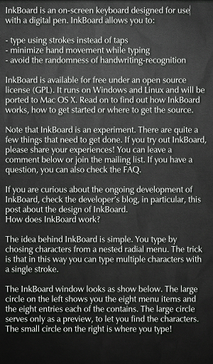
I have just published my first Android app on the Android Market. It is called Qute and it's a really simple plain-text editor that comes with several themes and a few open source fonts.
On the one hand, Qute is simply an exercise in writing software for the Android platform, leading up to more ambitious InkCode related projects. On the other hand, Qute is an experiment in aesthetics.
When writing text, whether in Emacs or Word, users are stuck with black letters on a plain white backround. (Or, more generally, monochromatic text on a monocgromatic background.) Sure, this setup is functional as it maximizes contrast. And it can even be pleasing, when it is taken to the extreme in such great full-screen writing apps as WriteMonkey, for example. But is that really all you can do, to make the screen space you are going to be staring at for hours appealing?

Contemporary webdesign realized a long time ago that subtle and skillfully chosen background gradients and textures can add a lot of depth to a website. In fact, I find websites easier to read if the background is not bright white or solid gray. Why has this realization not caught up with people developing application software? As I have argued previously, it is possible to make serious content look cool without decreasing clarity.
One great feature of current webbrowsers and operating systems that helps in this regard are text shadows. Solid white text will stand out well enough in front of dark gradients, but as soon as you add texture, the font becomes harder to read or simply looks out of place. Here, a text shadow can help. It adds a bit of contrast where it is needed, right around the edges of individual glyphs. Moreover, it gives the impression, that the text hovers in front of the background. This lends more depth to the image as a whole and it communicates that the background is just that: background. For me, this works very well.
So, when I tried out Android and realized that 1) most Android text editors are, for lack of a better word, ugly and 2) the few good-looking ones are stuck with Android's functional and clear but somehow annoying default fonts, I decided to go ahead and write Qute.
Let me conclude with a technical note: In webbrowsers, the CSS property for adding text shadows is, unsurprisingly, called text-shadow. Android Views have what is called a Shadow Layer. The CSS implementation has one crucial advantage over the Android one. In CSS, a single span of text can have multiple shadows attached to it. On Android this is not possible. As a result, in a webbrowser, text can be given very strong shadows by layering multiple black shadows on top of each other. As this does not work on Android, the shadows in Qute are often lighter than I would like.