This post is about different approaches to font rendering, what you can do if you prefer smooth over crisp fonts but are stuck on the Windows platform and how you can make sure Firefox and Qute take advantage of this workaround. But let's start from the beginning...
Motivation: EPUB versus PDF
Several people have called my attention to the EPUB document format as an alternative to PDF. Ya Knygar asked about an EPUB export option for Qute. Peter discussed math support in EPUBs. And we had a chat about the topic with the nice people from Design Science.
All in all, I think the format has great promise and I will definitely add an EPUB export option to Qute as soon as I have time. But there is one reason why I am not going to switch from PDF to EPUB anytime soon (even if EPUBs were widely available): In my opinion,
PDF readers have superior text rendering compared to EPUB readers.
Now, you may think that this problem will go away soon as EPUB readers improve. But things are not so simple. In this post, I will explain what the problem is exactly, why it won't go away soon, and what you can use as a workaround for the time being.
Before we start, I have to mention that the problem I am talking about affects only the Windows platform and mostly devices with low pixel density. It you are running Linux, you are probably fine, and if you are running Windows on your tablet, chances are good that the differences I am talking about are hardly noticeable. But if you are running Windows and plan to read PDF/EPUB articles on your desktop 23 inch Full HD screen, this might concern you.
Smooth versus crisp
The most important thing to understand about font rendering, is that there is no single "best" way to render a font. There are simply two different goals you might wish to achieve. You may want to:
- Optimize the contrast of the font to increase readability.
- Optimize the shape of the font to make it look pretty.
These objectives are in conflict with each other.
If accessibility is your primary objective, you want to optimize contrast. This means that you have to align the glyphs with the pixel grid of your screen. But if the font size is low, this means that you will have to distort the individual glyphs of the font. The result is crisp distorted text. This is the approach taken by Microsoft in their font rendering engines, including ClearType and DirectWrite.
If aesthetics are your primary objective, you want to optimize the shape of the font. That is, you want to reproduce the glyphs on screen exactly as the font designer intended. At low font sizes this is, of course, impossible. You will instead have to super-sample the individual glyphs and use lots of gray-scale pixels to give the illusion of an accurate shape. The result is smooth and accurate but blurry text. This is the approach taken by Apple in their font rendering engine, and, apparently, it is the approach taken by Adobe in the font rendering engine employed by the Adobe Acrobat PDF reader.
Now, we come to an example. The following text snippet is taken from Martin Fenner's blog and typeset in Palatino Linotype. On the left it is reproduced in an EPUB document which is rendered by EPUBReader on Windows 7 while ClearType is turned on. On the right it is reproduced in a PDF document which is rendered by Adobe Acrobat Reader on Windows 7. (Note that these images may look different on your screen than they do on mine due to different subpixel orderings.)
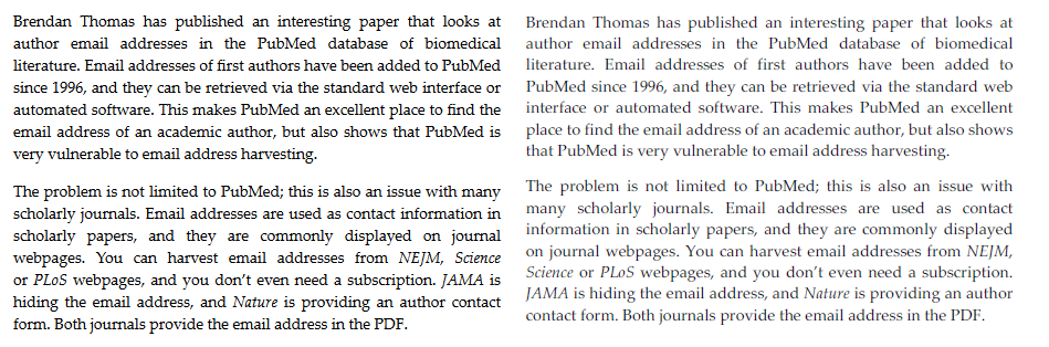
Opinions about which rendering is better will differ. Personally, I think "smooth but blurry" is far better than "crisp but distorted".
This is especially true of in case of serif fonts. There is no doubt that the ClearType approach can render sans serif fonts beautifully, e.g., Consolas as rendered on Windows 7. But with most serif fonts, trying to align them automatically with the pixel grid is simply a lost cause.
Technological Subtleties
If you experiment with viewing EPUBs in different applications, you will notice two things:
- On platforms other than Windows EPUBReader renders EPUBs just fine.
- All EPUB readers on Windows suffer from this font rendering problem (including Adobe's Digital Editions).
These two phenomena have a common cause: EPUB readers typically use the layout engines of popular webbrowsers to display text. These layout engines, in turn, use the font rendering API of the operating system to render text.
These two facts will not change in the near future. The layout of HTML code is a complex task, so EPUB readers will rely on browsers to do the job for them. (This is also witnessed by the fact, that even though the Adobe Reader has an excellent font rendering system, Adobe Digital Editions does not use it. Even though Adobe can do font rendering better than the OS, they cannot do text layout better than web browsers.)
Browsers, in turn, will rely on OS font rendering mechanisms, in order to guaranty consistency of text rendering across all applications on a given system. In this regard, web browsers differ fundamentally from PDF viewers. Adobe Acrobat's job is to render pages exactly the same on all platforms. For web browsers and for the EPUB format, this is a non-objective.
In many ways, this is a good thing! EPUB allows users to customize the appearence of a document to their liking, and I am all for that! The only downside is that if 1) I disagree with the font rendering algorithm of my operating system, and 2) I can't switch operating systems until there comes a Linux for tablet PCs with decent digital ink support along, I am stuck.
Workaround: GDI++
As it turns out, I am not quite stuck. Thanks to GDI++.
GDI++ is a marvelous little library, that replaces the standard GDI font rendering mechanism on Windows with a font rendering mechanism based on FreeType. You can activate and deactivate GDI++ from a tray icon, and as easy as that, have all Windows applications have beautiful smooth FreeType-rendered fonts! On top of that GDI++ is highly configurable - even though I have to admit, that I have not tried all of these options yet.
Of course, there are some pitfalls.
First of all, GDI++ does not appear to be actively maintained. On this page, there is an announcement stating that GDI++ development has been discontinued. However, there are still a number of updates available here, some as recent as 2011. The wiki mentions InkStone as a follow-up project. But, apparently, InkStone development never got going.
Second, most of the GDI++ documentation as well as the community web pages are in Japanese. So, for me at least, it is quite hard to figure out what is going on. (Even though Google's translation services are a big help.)
Third, GDI++ changes the font rendering only in those applications that use GDI for drawing text. This includes, for example, such heavyweights as Microsoft Word, which all of sudden becomes really pleasant to look at. (If I had know about GDI++ from the start, I might not have been driven to such as extremes as writing my own text editor...) But not all Windows applications use GDI.
Firefox and GDI++
Chrome works with GDI++ version 8.1.2009.0211 out of the box. But Firefox does not.
When you activate GDI++ from the tray, all text in Firefox (including the EPUBs rendered by EPUBReader) remain unaffected. The reason is that recent versions of Firefox use Direct2D as rendering engine and not GDI. The advantage of this approach is that web pages in Firefox are rendered using hardware acceleration! The drawback is that GDI++ does not work.
To get GDI++ to work with Firefox, you need to disable Firefox' hardware acceleration. You can do this via the "Advanced Properties" tab, where you need to uncheck the "use hardware acceleration" box. After a restart while gditray is running, Firefox should render beautifully antialiased text.
The following example shows the aforementioned text snippet rendered by EPUBReader using ClearType/DirectWrite (on the left) and using FreeType/GDI++ (on the right).
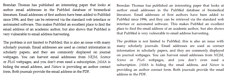
To my eye, the FreeType version is so much better! The font now actually looks like Palatino!
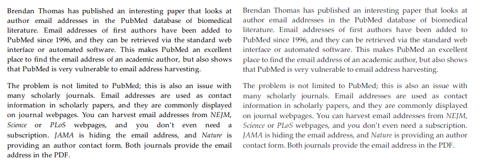
The rendering is not perfect, however. A direct comparison of FreeType/GDI++ (left) with Adobe Acrobat Reader (right) is shown below. While the Adobe rendering is a bit too light for my taste, it is clearer than the FreeType rendering. A compromise between these two would be optimal, in my opinion.
On the whole, I definitely want to use GDI++ for EPUB reading. But whether I want to do all my browsing with Firefox' hardware acceleration turned off is another matter. If hardware acceleration is a must, another option is to use Firefox' Anti-Aliasing Tuner, which allows you to tweak the Direct2D font rendering. If you use the "Outline" rendering mode, you get results similar to FreeType/GDI++. However, even after quite some experimentation with the Anti-Aliasing Tuner's options, I have not been able to produce results on par with the FreeType/GDI++ rendering.
Qute and GDI++
Of course my most important use-case for GDI++ is Qute. As Qute is built on Chromeless, which is built on Mozilla's Xulrunner, you need to disable hardware acceleration here as well. To do this, proceed as follows:
In the Qute application directory, edit the text file
defaults/preferences/prefs.js
to include the lines
pref("gfx.direct2d.disabled", true);
pref("layers.acceleration.disabled", true);
If you now launch Qute while gditray is running and active, you get smooth fonts in Qute!
The following is an example. We have Qute with ClearType/DirectWrite text rendering on the left and with FreeType/GDI++ text rendering on the right.
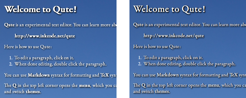
There is no doubt that "smooth" font rendering is better suited to Qute than "clear" text rendering: Qute already chooses aesthetics over accessibility by using background images and text shadows - using smooth but blurry fonts is one more step in the same direction.
One more tip: You can also put the two pref lines above into a separate text files in the defaults/preferences/ directory. In this way, you can switch quickly between the two font rendering engines, by moving that file in and out of the preferences directory (and restarting Qute).
Conclusion
Font rendering is controversial. The intricacies of the problem force users and developers alike to choose between bad and worse. Unfortunately, I find myself disagreeing with the manufacturer of my operating system in this dilemma. GDI++ provides a beautiful workaround, but given that DirectWrite is going to become more widespread in the future, this workaround can only be temporary.
The success of the EPUB format will probably not hinge on this issue. Especially as the importance of the Windows platform is going to decline. However, if there is a moral to this story, it is this:
The aesthetics of computing are important.
And if EPUB and ebooks in general are to be a success, developers have to take extra care to make even the details look good - even if this means making controversial choices.