I have been experimenting with a pen-centric on-screen keyboard called InkBoard and my experiments have reached the point where I would like to write about them. So I have created InkCode, a laboratory for digital ink applications, and released a (very early) version of InkBoard. There is still a lot to be done, but you will get the idea.
In this post I motivate the design of InkBoard, explain some of the choices I made and indicate what the next steps in the development are. Before you read on you may want to check out the InkBoard website, but the text that follows should be self-explanatory.
Motivation
Writing with a pen on a tablet computer produces beautiful handwritten text. But sometimes that is not what you need. Sometimes you want that text to be encoded, character by character, in a way that current systems can process - for example when you type a query into Google.
There are two ways to achieve this with a pen:
- Use handwriting recognition software.
- Use on-screen keyboards.
Both have their drawbacks.
Current handwriting recognition software works well but not perfectly. Most annoyingly, a given word you write will sometimes be recognized correctly and sometimes not, in a way that often feels unpredictable to the user. Moreover, the word to be recognized needs to be stored in the algorithm's dictionary - and many Google query strings are not. Finally, a misclassification by the recognition engine results not in a spelling mistake, but causes a different word than the user intended to be placed in the text, which can change the meaning of a sentence.
On screen keyboards, on the other hand, are often just that: keyboards. A bunch of buttons laid out on screen that the user has to hit with a pen. This is awkward for a number of reasons.
- Tapping and clicking are awkward motions to carry out with a pen - especially if you try to tap lots of different keys in rapid succession. Pens are made for strokes.
- Keyboards are designed to be worked with ten fingers. Being able to use just a single pen confines you to one-finger-hunt-and-peck.
- The pen (and thus your hand) has to constantly travel across the entire on-screen keyboard, which often takes up a significant part of the screen. These long distances are strenuous and slow you down.
Objectives
The goal, therefore, is to develop an on-screen keyboard that is specifically designed for pen use and avoids all of these deficiencies. Let's call this device an inkboard. The following features distinguish an inkboard from the two aforementioned pen-centric text-encoding systems.
A) The inkboard behaves deterministically. It never makes choices that appear arbitrary from the users point of view. No "recognition" is going on.
This is what makes the inkboard a "keyboard" as opposed to a gesture-recognition software.
There are several aspects to this. Foremost, the inkboard has to be a trivial machine, in the sense that it has no internal state that is invisible to the user. But there is a more subtle issue here. For all practical purposes, pen input appears continuous to the user. Text encoding is thus a process of discretization. The problem now is that the abstract function that maps continuous input to discrete text may produce different values for input strokes that the user perceives as identical. Thus, some of the apparent arbitrariness that plagues recognition software is inherent in the problem and not an artifact of the solution.
B) The inkboard is operated using strokes. The continuous motion of the pen is the significant input communicated by the user to the application.
A bit of information indicating whether or not the pen is touching the tablet may be a relevant part of the input as well. However, operating the inkboard with strokes instead of taps must have a significant advantage over tap-centric input methods. Note that we might also allow the pen not to touch the tablet at all. (Digital ink technology can detect the position of the pen even if the pen hovers above the board.) Whenever we speak of strokes in this section we should therefore rather speak of pen motion. But for convenience we will, by abuse of language, stick to the term "strokes".
C) The typical pen motions required by the inkboard are of a shape that can be drawn easily using a pen.
For a right-handed writer such shapes are elliptical and slanted from the bottom-left to the top-right. In what follows below we will depart from this optimal shape slightly and focus on strokes contained in a small circle.
D) The typical pen motions required by the inkboard are as small as possible without compromising usability.
In particular, if tiny motions become significant, the user's input may again have effects that appear arbitrary from his point of view. This is to be avoided. At the same time the pen tip and especially the hand and wrist of the user should not, typically, have to move long distances.
These are the theoretical properties, we would like an inkboard to have. But of course there are a few practical properties we would like it to have as well. Namely:
- Writing with the inkboard should be efficient. The writing speed of touch typing may well be out of reach. But it should be possible to achieve average human handwriting speeds of about 30 WPM after training.
- Writing with the inkboard should be ergonomic. It should not cause strain in hand or wrist. After training, the user should not have to concentrate on the process of writing with the inkboard but should rather be able to focus all of his attention on the text.
- Writing with the inkboard should not be too difficult to learn. Some training will be required, but is should be significantly quicker to learn than the more involved shorthand systems for handwriting.
So. Now the goals are clear. We know what we want from the abstract inkboard we are looking for. Next I am going to describe InkBoard, the concrete system I have come up with to achieve this vision.
The Idea
The idea behind InkBoard is simple. You type by choosing characters from a nested radial menu. The entries in the radial menu are activated whenever the users strokes touch them. The trick is that in this way you can type multiple characters with a single stroke.
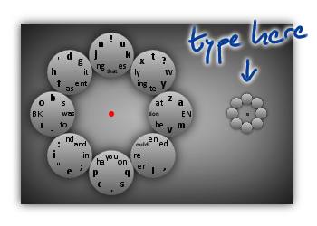
The InkBoard window looks as shown below. The large circle on the left shows you the eight menu items and the eight entries each of them contains. The large circle serves only as a preview, to let you find the characters. The small circle on the right is where you "type"!
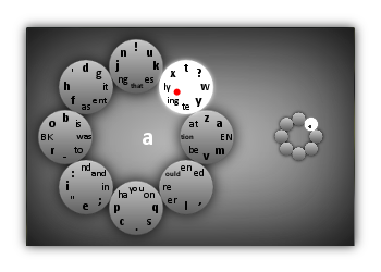
Now, let's look at an example: we will type the character 'a'.
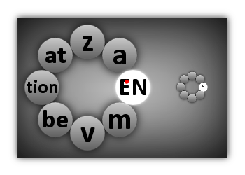
The important thing is that you can chain these moves together to type long sequences of characters with a single stroke. A few examples are these.
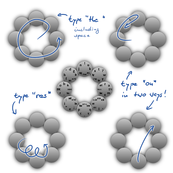
Two more features of InkBoard are worth mentioning:
- When the user lifts the pen off the screen, InkBoard immediately returns to the root of the menu. So if you selected a submenu by mistake, all you need to do is lift the pen to get back.
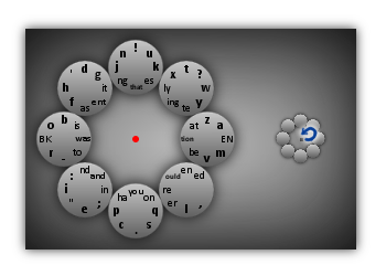
- To be able to type additional characters (including capital letters) the user can tap InkBoard once to switch to a different "layer" of the layout.
That is all there is to it.
Analysis
Does InkBoard achieve the objectives laid out above? In other words: Is InkBoard an inkboard? The abstract objectives are certainly achieved, at least to some degree.
A) InkBoard is deterministic.
There is no kind of recognition going on. Only the menu items the user's strokes touch are of relevance. However, the arbitrariness inherent in the problem of discretizing strokes into (encoded) text cannot be entirely avoided. Particularly if the menu on the right hand side is small, it may well happen that the user inadvertently touches upon menu items he did not want to select. This can be avoided by making the menu larger, at the expense of objective D). However, as the menu can be scaled continuously, I hope that every user will be able to find a compromise that works for him- or herself.
B) InkBoard is operated using strokes.
Stroking over several menu items in succession is significantly more efficient and comfortable than tapping all these menu items sequentially. Here, however, the way users interact with InkBoard is important. If a user uses one stroke for each character, he will still have to tap the screen once per character and (except for reducing hand movement) nothing will have been gained over traditional on-screen keyboards. InkBoard can only be used effectively if the user actually types several characters using a single stroke by chaining together the "atomic" strokes for typing individual characters. The radial menu shape of InkBoard allows any two atomic strokes to be chained together. Thus, theoretically, an entire novel could be written with a single stroke. In practice, however, it will be much more convenient to lift the pen from the screen after a couple of characters. The reason for this is that if the pen is off the screen, the user does not have to worry about inadvertent selection of menu items. Also, lifting the pen resets the menu. So if an inadvertent selection happened before, the resulting typing mistake is not propagated to subsequent characters (see below). On the whole, the efficiency of InkBoard depends upon the users ability to make a habit of writing compound strokes and commit these movements to muscle memory.
C) Typical strokes can be drawn easily.
This is true insofar as strokes are confined to a small circular area, can be drawn without moving the hand and are typically "loopy" in shape. However, whether typical strokes can be drawn easily depends on two things. First, which strokes are typical is determined by the language of the text being written and the layout of the inkboard. I will write in detail about the current layout of InkBoard (which was designed for the English language) in a subsequent post. Second, I do not have a precise model of which strokes are drawn easily. Selecting adjacent menu items is certainly "easy". But what, precisely, is the cost of reversing direction? And what, precisely, is the penalty imposed by stroking over non-adjacent menu items? What role does the angle of the strokes play? These questions have to be answered in a quantitative manner, in order to design a truly optimal layout. Another question is, whether the radial menu should be given an elliptical shape, slanted (for right-handed users) from the bottom-left to the top-right.
D) Typical pen motions are small.
This is guaranteed by the small size of the menu. Also, frequent characters are produced by selecting adjacent menu items. As mentioned above, there is a trade-off between the size of the strokes and the risk of inadvertently selecting the wrong menu items.
So far for the theoretical properties. But what about the practical ones? Is typing with InkBoard efficient, ergonomic and easy to learn? I do not know, yet. Using InkBoard effectively does definitely require systematic training. The next major goal of this project is therefore to develop a training program. Then one can start to measure what writing speed users typically achieve with InkBoard after completing the course and what strokes they can write easily. Using this information the layout of InkBoard can then be revised accordingly.
Variants
On my way to the current design of InkBoard, I have gone through several variants, the most important of which I briefly discuss here.
Currently, the position of the radial menu is fixed on the screen while typing. Initially, though, the idea was to have the radial menu move with the pen.
If $p$ is the center point of the top-left menu item and the top-left menu item is selected, then the submenu was centered at $p$. At that point the radial menu had six entries instead of eight, so this scheme amounted essentially to the pen moving in an infinite hexagonal grid. From a theoretical point of view, I found this very appealing, however it turned out to impractical. The user had a hard time keeping his strokes aligned with this hexagonal grid. Tiny "errors" in the user's movements would accumulate over time. The atomic stroke for, say, the third character in a chain might be accurate, but if the starting point was off by few pixels, a typing error would result.
To avoid this problem, I considered a variant of the above idea. Instead of centering the submenu at $p$, the submenu would now be centered at the point $q$ where the pen had first touched the menu item. In this way the center of the menu would automatically adjust to the pen motion and "errors" in the user's movement would not accumulate. In this scenario, the menu items would not be represented by disks. Instead, the menu would have the form of a ring, and the menu items would be slices of this ring. Thus the tip of the pen would always be at a constant distance from the center of the menu, whenever a menu item was activated. This second variant worked better, but was still impractical. The main problem, as I now see it, was that the hand and wrist of the user needed to move progressively across the screen as he was writing text. These large movements made the stroke accuracy required to type quickly difficult to attain.
I then settled on using a fixed menu, allowing a kind of "in-place handwriting". This way the wrist and most of the hand could stay put. Only the tip of the pen needed to move.
Using digital ink technology, the tip of the pen can be located even if it does not touch the screen. This gave me the idea of writing without strokes. The pen only needed to hover above a menu item, for the item to be selected. I hoped, that this would reduce the strain on the hand even further, because the user did not need to exert pressure on the tip of the pen. The opposite was the case, however: the strain on the hand and wrist increased significantly. The reason was that the user had to carefully control the position of the pen tip all the time, in order not to select a wrong menu item accidentally. Such an inadvertent selection was particularly "dangerous", as this would place the menu in an incorrect state (a submenu was opened, even though the user intended to be in the root menu) and cause multiple typing errors at once. This constant control the user had to exert increased the strain, rather than reduce it, and so I switched back to the traditional way of selecting menu items via strokes. That using strokes is more efficient is perhaps not surprising: by taking the pen pressure into account, the user is able to communicate more information to InkBoard, than if this bit of information is ignored.
Conclusion
Where to go from here? I would invite you to try out InkBoard and tell me what you think about it. As I mentioned, the next major goal of the project is to develop a systematic training program. The next post on this blog will deal with the considerations that went into the current InkBoard layout and how it should be revised.
InkBoard is an experiment. It has now reached the state where it can be unleashed upon the empirical world. Empirical observations will tell us, if there is merit in this idea. All I can say right now is that the digital pen has a lot of potential and that this potential will need many more experiments before it can be fully realized.
